With Web design taking a new shape, Colors have become even more important and meaningful in web designing. A color not only grabs attention of the website visitor but also make your brand meaningful. For beginners in designing, a Color Wheel can be useful. Because, the right choice of colors makes a website visitor stay longer on your page, which in turn increases the chances of conversion.
Color choices can vary depending on many factors including- Brand category, Target audience, Text and Background color choice etc. Sometime the brand demands really bold colors whereas sometime it needs to be a mix of soothing colors. On the other hand the right mix of colors on your website matters. Let’s dig more into the Color Wheel and the latest color trends to understand the right color mix for your website.
A Perfect Color Palette strengthens a website and attracts visitors
Be it a logo design, a brochure or a website design, choosing a color can be wearisome. Where do you start? Which colors go with the other? What is the significance of each color? How to drive the Visitors emotions?
Well!! Let’s start with understanding the color theory!!!
Color Wheel and Color Pallets:
Color wheel is a circle of colors, arranged as per their chromatic representation and the relationship between primary, secondary and Tertiary Colors. There are 4 different principles to use the combination of colors such as – complementary, monochromatic, analogous colors and Triad colors.
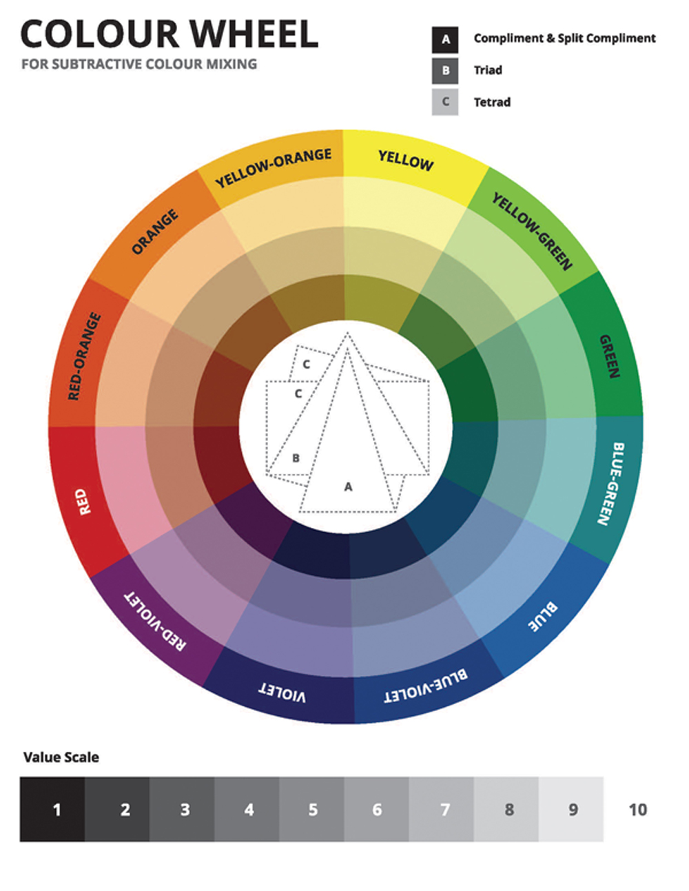
Significance of the colors used for Web Design:
All Colors have their own significance. Use of any particular color for a brand, influence the image of the brand. It’s really important to understand the meaning and choose accordingly. Here is a list of few color and their significance to help you choose better.
Red:

Red colour signifies Energetic, Sensitive, Obsessive, Strength, Love, Power, enthusiasm, vibrancy and danger. Red is often used for creating an alert or in call to action buttons.
Orange:

Orange colour is used for warm, passionate, sense of accomplishment, determination, Welcoming kind of website. Its best suited for food related websites
Yellow:

Yellow relates to Happiness, Animated, Active, New, positive, youthful, caution, sunshine, intensity etc. It’s the easiest color for the daylight.
Blue:

Blue is the color for Luxury, Clarity, peaceful, faith, honesty, Loyalty and Reliability. Best for service related website. So far it’s the maximum used color in web designing.
Green:

Green symbolizes fresh, tranquility, comfortable, Confident, Remedial, environmental, nature, economics, fitness, wariness, and growth. Normally used by websites related to health, wellness, nature, natural care etc.
Purple:

This is a vibrant color used to refer to Luxury, Charm and Glamour, romantic, influence, Nostalgic, Motivation, Divinity and prosperity. Brands with a sense of luxury, creativity and royalty use this color as their brand color.
Pink:

Pink is the color of Soft, Sweet, Feminist, Love, Lively and Sympathetic. It signifies sweet, idealistic gesture. Mostly brands with feminine products use this as their brand color.
Black:

Black is a powerful color which signifies Influential, Bold, Serious, Sophisticated, Luxurious, Intense, Formal, intensity, authority and edginess. It’s the second common color which many websites use for their web designing.
White:

White is the color of Peace, purity, Innocence, neutral and clean. Ecommerce websites use white as a background to highlight many brands on them with varied color formats.
Gray:

Gray is the most neutral color and mostly used as a background color.
Tips to choose the right color for your business
You should always plan to choose 3-4 colors in the below format. Though it totally depends on the brand and the designer how he can play with the different colors, but more than 4 colors in a website destroys the beauty of the website. The 3-4 colors you choose should follow the below rules-
1. Choose a Base color for your brand
This is the most important color choice for your website. 60-70% of your website will be the base color only. Choose a color carefully which depicts your brand identity, your target audience and the brand persona. The other colors in your palette will be ones which goes well with the base color.
2. Choose 1-2 colors as the Accent Colors:
A maximum of 1-2 colors should be used as Accent colors. These colors are used to highlight the main areas or for a call to action button. Accent colors are generally bold or vivid and chosen in contrast to the base color to create a rhythm in the website. They lead to a great user experience with easy and better navigation within the website. Choosing the accent color for your website is tricky. It should make perfect combination with the base colors. There are several tools that can help choose the right color as the accent color.-
Adobe Color CC:
The most prominent tool that helps you choose the right color based on the color model and harmony you choose. It gives you freedom to choose your own colors using the color wheel and completely free for use.
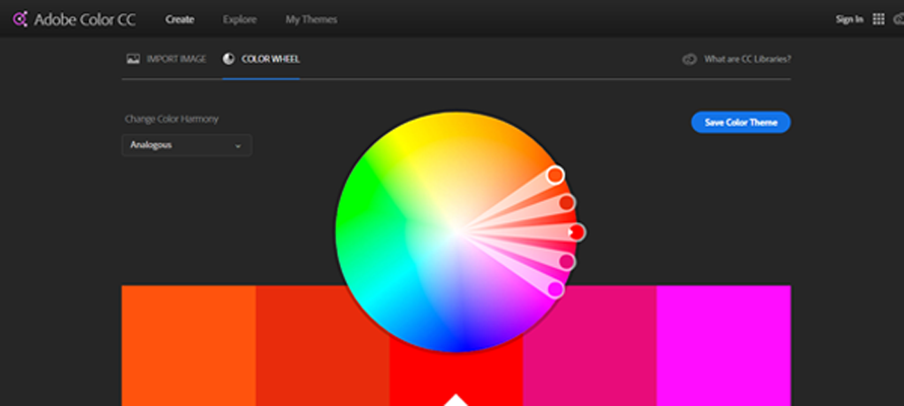
Coolors.co:
It’s a completely free tool. You can easily export the color theme via PDF, png, SCSS or SVG. Its supported in Android and IOS
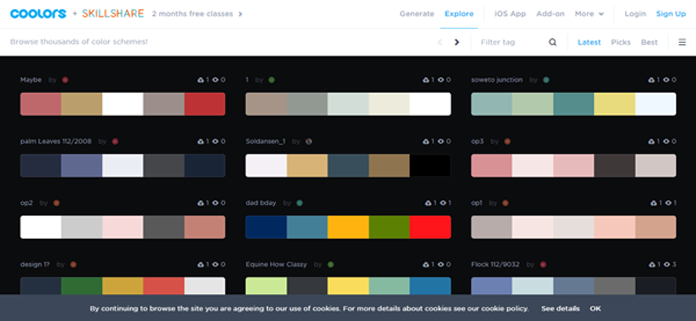
Apart from these 2, there are few other tools such as Canva, Typekit, Fotojet, Icons8App which can be used for choosing your color scheme.
3. Choose a neutral Background Color:
The background color plays an important role in giving emphasis to your web design. It helps the visitors focus on your main part of the website by giving a neutral color to the unusable area. It also makes your content more visible and readable. Choosing a background color is the last step of your Color selection process. It depends on the type of business you are in. Ecommerce or any content intensive website choose white as their background so that the content becomes more visible. Similarly websites with fashion, creative, designing etc., use colorful backgrounds to add the much required drama to their web design.
Final Notes..
Moreover choosing colors is never based on your favorite colors, rather it totally depends on your brand preference, Target audience and company type. A color that works for a product brand might not be successful for a service brand. But you don’t need to be a renowned artist to make the color choices. You just need to understand the color theory, and work towards it. The agenda should be to first choose the Base color based on your brand, choose the Accent color based on your base color and at last, choose the background color based on both base and accent colors.
We are masters of creating emotional connect with the audience through web designs, colors and creativity. You can give us your valuable suggestions and feedback to improve more.
To get latest content on Web, Design, Graphics, internet, Follow us on Facebook and Linkedin.




Thanks for the great post